

Why Charts Matter:
If you've ever wondered why traders stare at charts, it's because charts tell the story of a stock’s price. Instead of just seeing numbers, you get a visual picture of how the price has moved over time. Charts help you quickly spot trends (is the stock generally going up or down?) volatility (how wildly does it swing?) and key price levels. In short, charts turn a table of prices into an easy-to-understand picture. This is why mastering charts is so important for trading—it’s like learning to read the market’s diary.
Types of Stock Market Charts:
There are several kinds of charts, but let's start with the three most common ones you’ll encounter on the Sahi app or any trading platform:

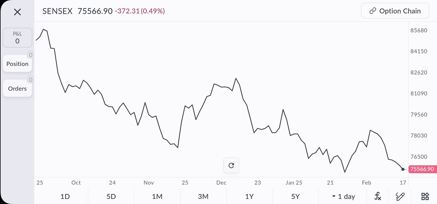
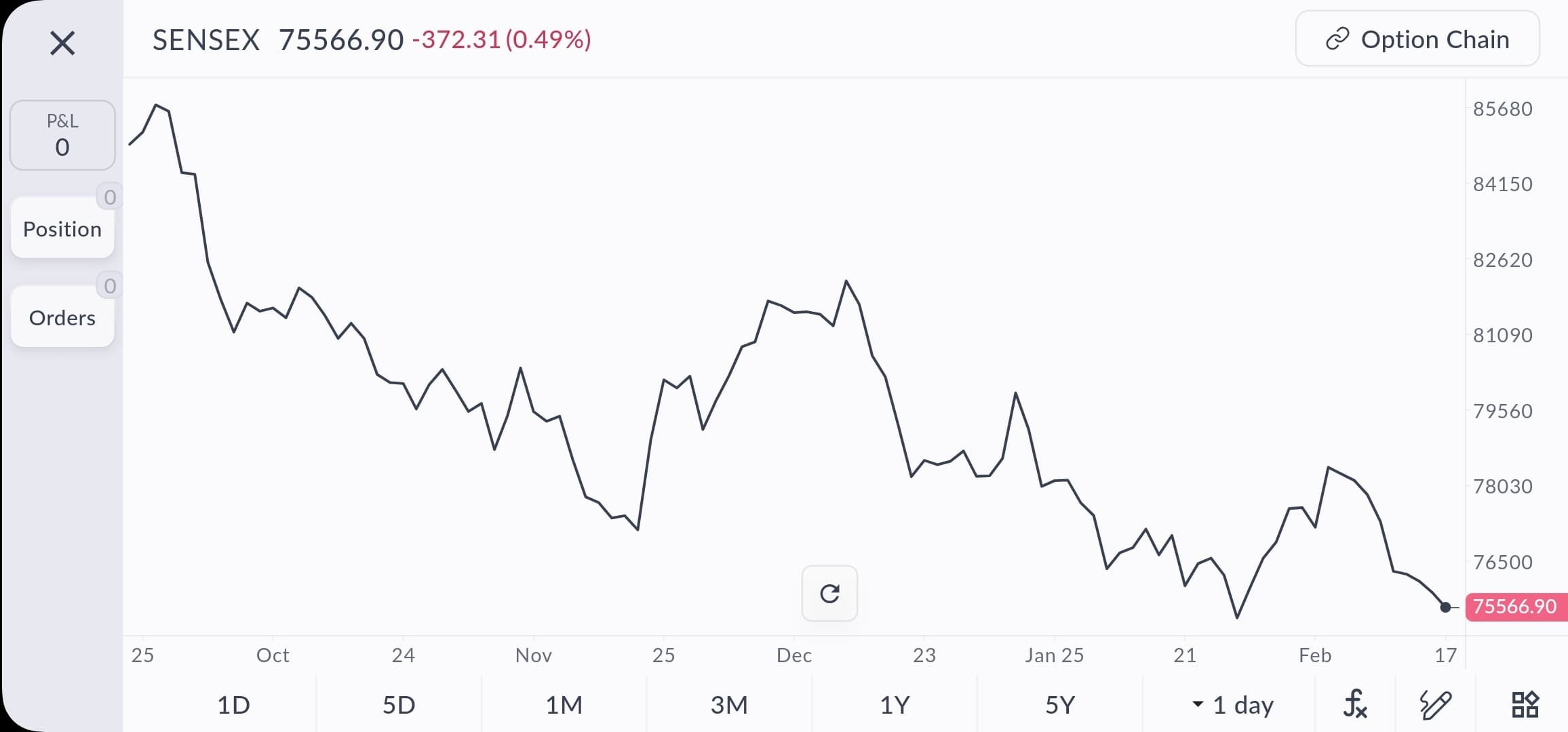
Line Chart: A simple chart that plots the closing prices over time, connecting them with a line. It gives you a quick overview of the price trend. For example, a line chart of Tata Motors might show the stock steadily rising from ₹300 to ₹400 over six months with some small dips in between. Line charts are clean and great for spotting the overall direction, but they don't show intra-day details
Bar Chart: A chart that gives more detail for each period (say, each day). Each time period is represented by a vertical line (showing the day’s range from low to high price) with small horizontal ticks to the left and right. The left tick marks the opening price and the right tick marks the closing price. If the right tick is higher than the left, the price rose that day (bullish); if lower, it fell (bearish). Bar charts let you see the open, high, low, close (OHLC) for each day. For instance, a single bar for Infosys might show a low of ₹1,480, a high of ₹1,530, opening at ₹1,500 and closing at ₹1,520 – indicating Infosys closed higher than it opened.
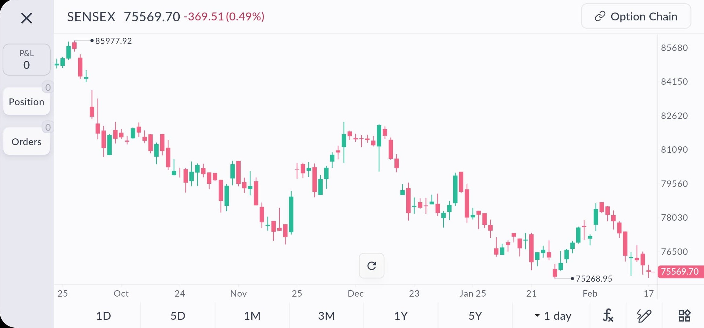
Candlestick Chart: Perhaps the most popular chart type among traders, candlestick charts also show the OHLC for each period, but in a visually richer way. Each period is a “candle” with a body (the range between open and close) and wicks/shadows (thin lines showing the highs and lows). Typically, a green (or white) candle means the stock closed higher than it opened (up day), and a red (or black) candle means it closed lower (down day). Candlesticks make it easy to spot patterns at a glance. Don’t worry, we’ll dive deeper into candlesticks in the next module since they are super important for technical analysis.

Reading Basic Price Movements:
Regardless of chart type, start by looking at the overall direction of the price. Is it going up (uptrend), going down (downtrend), or moving mostly sideways? An uptrend means each successive high price is higher than the previous (and the lows tend to be higher too). A downtrend means each successive low is lower (and highs are lower too). Sideways (or a range-bound market) means the stock is oscillating between around the same high and low without a clear upward or downward path. For example, if HDFC Bank shares move from ₹1,000 to ₹1,100 over a month, that’s an uptrend. If they slide from ₹1,100 to ₹1,000, that’s a downtrend. If they bounce between ₹1,000 and ₹1,050 repeatedly, that’s a sideways range. As a beginner, focus on identifying these broad movements first. You: “Alright, I see the stock was rising steadily last month (uptrend), then it started falling this week (downtrend).” Great! You just read the basic story of the chart.

Next, we’ll zoom in on candlestick charts and learn how to read the unique patterns they form.