

Candlestick charts are a favourite tool because they pack a lot of information into each “candle” and they form patterns that can hint at what might happen next. In this module, let’s break down candlesticks and learn some common patterns. Don’t worry if it feels like learning a new language at first—with a bit of practice, you’ll start recognising these patterns easily.
Basics of a Candlestick
Each candlestick represents a time period (like one day, if you’re looking at daily charts). It has two main parts:
The body is a rectangle that shows the distance between the opening price and closing price.
The wicks (shadows) are thin lines above and below the body that show the highest and lowest prices reached during that period.
If the candle is green (or hollow/white), it means the price closed higher than it opened (an up day). If it’s red (or filled/black), the price closed lower than it opened (a down day). For example, suppose Reliance Industries opened at ₹2,100 and closed at ₹2,150, with a high of ₹2,160 and a low of ₹2,080 in the day. That day’s candlestick would be green, with a body spanning ₹2,100 to ₹2,150, a lower wick down to ₹2,080, and an upper wick up to ₹2,160. This one candle tells us a story: Reliance’s stock went up that day, trading within a range but closing higher than it started.

Common Candlestick Patterns
Now, individual candles and groups of candles can form recognizable patterns that traders use as signals. Here are some of the most well-known candlestick patterns:
Doji:
This pattern looks like a plus sign or cross – the opening and closing prices are almost the same, so the candle’s body is very small or just a line. A Doji indicates indecision in the market: buyers and sellers fought but neither won. By itself, a Doji is neutral, but its significance comes from where it appears. If you see a Doji after a strong uptrend, it could mean the buying momentum is weakening (potential reversal down). After a downtrend, a Doji might signal that selling is losing steam (potential reversal up). For example, if Infosys was rallying and hit ₹1,600, and that day’s candle is a Doji, it suggests traders are unsure about pushing it higher – a reversal might be coming. Always confirm with the next day’s move, though!

Hammer:
A hammer is a bullish reversal pattern that appears after a downtrend. It has a short body near the top (can be green or red, but green may be slightly more bullish) and a long lower wick (with little or no upper wick). It looks kind of like a hammer with a long handle. This means the stock dropped significantly during the day (long lower wick) but then bounced back and closed near or above its opening price (small body up top) – buyers stepped in strongly. A hammer suggests the downtrend may be ending and an upward reversal could follow. For instance, imagine TCS (Tata Consultancy Services) was falling for a week and reached about ₹3,000. One day it plunges to ₹2,900 (intraday) but then rebounds to close at ₹3,050, forming a hammer candlestick. Traders seeing this might say, “Looks like ₹2,900 is a strong buying level; the stock could be reversing up from here.”

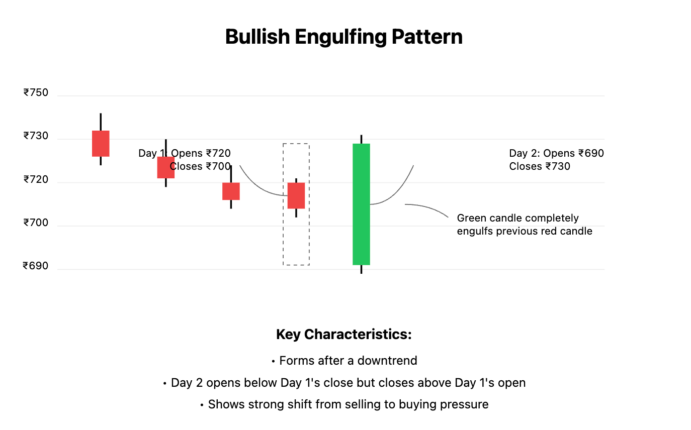
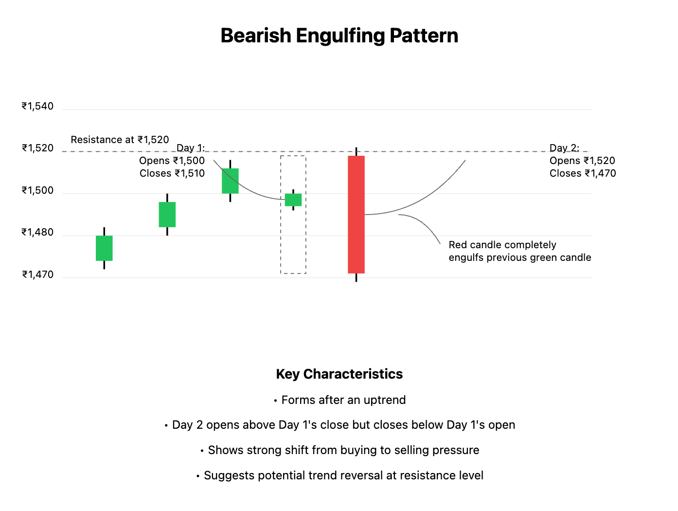
Engulfing Pattern: There are bullish and bearish versions of this two-candle pattern:
Bullish Engulfing:
Occurs in a downtrend. Day 1: a small red candle. Day 2: a big green candle that engulfs the previous day's range (its body completely covers the previous day’s body from open to close). This shows a sudden surge of buying strength – buyers not only negated the previous day’s losses but closed much higher. It’s a strong bullish signal that the trend might be turning up. For example, an ICICI Bank stock downtrend might produce a day where it closed at ₹700 (down from an open of ₹720). The next day, it opens around ₹690 but then buyers drive it up to close at ₹730, engulfing the previous day’s range. That’s a bullish engulfing pattern.
Bearish Engulfing:
The opposite, in an uptrend. Day 1: a small green candle. Day 2: a large red candle that engulfs Day 1’s body. This indicates sellers have taken control, suggesting a potential move down. e.g., HDFC Bank rises to ₹1,500 and one day closes at ₹1,510 (from ₹1,500 open). Next day, it opens near ₹1,520 but then selling pressure sends it down to close at ₹1,470, engulfing the previous day’s small gain – a warning that ₹1,520 might’ve been a short-term top

Others: There are many more candlestick patterns (like Shooting Star – which is like an upside-down hammer at the top of an uptrend signaling bearish reversal, or Morning Star and Evening Star which are 3-candle reversal patterns). But as a beginner, focus on a few key ones like the above. These patterns basically help answer: “Are buyers or sellers gaining strength at this point?” By recognizing them, you gain clues about possible next moves.


How Traders Use These Patterns
Traders often combine candlestick patterns with other clues (like support/resistance or indicators, which we’ll learn later). For example, seeing a Hammer at a known support level is a stronger signal to buy than a hammer in the middle of nowhere. Or a Bearish Engulfing right near a resistance level might be a signal to sell or short. It’s also important to wait for confirmation: often traders wait for the next candle to move in the expected direction after the pattern before acting. Conversational tip: Think of candlestick patterns as little signposts on the chart. They’re saying “hey, something might be changing here!” – but you, as the driver (trader), will check the road (other analysis) before making a turn.

Now that you can spot some candlestick patterns, you’re building a stronger foundation for chart reading. Next, we’ll learn about support and resistance, the key price levels every trader watches.