

Technical indicators are like extra lenses you can put on your chart to see things from a different perspective – be it momentum, volatility, or market strength. They are calculated from price (and sometimes volume) data and often shown in separate panels or overlaid on the chart. Indicators can help you decide when to enter or exit trades, but remember, they are aids, not magic. It’s best to use them in combination with price action (patterns, support/resistance).

Let’s cover a few popular indicators: Relative Strength Index (RSI), Moving Average Convergence Divergence (MACD), and Bollinger Bands – and see how to interpret them. (There are many others like Stochastics, ADX, etc., but these three are a great starting point.)
Relative Strength Index (RSI):
RSI is a momentum oscillator that ranges from 0 to 100. It basically measures the speed and change of price movements. The key idea with RSI is identifying overbought and oversold conditions:
If RSI goes above 70, the stock is considered overbought (meaning it’s had a strong run up and might be due for a pullback or pause).
If RSI goes below 30, the stock is oversold (meaning it’s been beaten down and might be due for a bounce).
For example, if Infosys has been rallying for weeks and the RSI climbs to 75+, it tells you the stock might be overextended – buyers may be exhausted soon. Traders might be cautious about entering a new long position and could even prepare for a minor dip. Conversely, if Tata Steel has been falling and RSI sinks to 25, it indicates oversold conditions – the selling may have been overdone, and a rebound could be on the horizon. Traders might look for a buying opportunity or at least tighten stop-losses on shorts. Important: Overbought can stay overbought in a strong trend (same for oversold), so these are warning signs, not automatic reversal signals. Often, traders use RSI together with support/resistance: e.g., RSI < 30 while the price is at a known support level could be a stronger case for a bounce


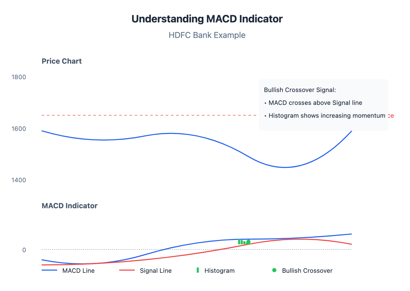
Moving Average Convergence Divergence (MACD):
Despite the long name, MACD basically is an indicator that follows trend and momentum and can signal changes in trend. It consists of two lines (the MACD line and the Signal line) and a histogram that shows the difference between those two lines. You’ll usually see it in a panel below the chart.
When the MACD line crosses above the Signal line, it’s often interpreted as a bullish signal (momentum shifting up).
When the MACD line crosses below the Signal line, it’s a bearish signal (momentum shifting down).
The zero line: MACD oscillates above/below zero. If both lines are above zero, momentum is generally bullish; below zero is bearish territory

Think of MACD crossovers like two moving averages crossing but applied to an indicator. Traders like MACD because it can sometimes signal a trend change before price actually breaks out. For example, suppose HDFC Bank stock has been drifting down. You notice the MACD histogram bars are getting smaller and the MACD line is curling up toward the signal line. Eventually, MACD crosses above the signal while HDFC stock hasn’t moved up a ton yet. This bullish crossover could hint that the downtrend momentum is ending and an up-move might start – maybe a good time to pay attention for a buying opportunity. If the price then breaks a resistance or a trendline, you have both price and indicator agreeing.
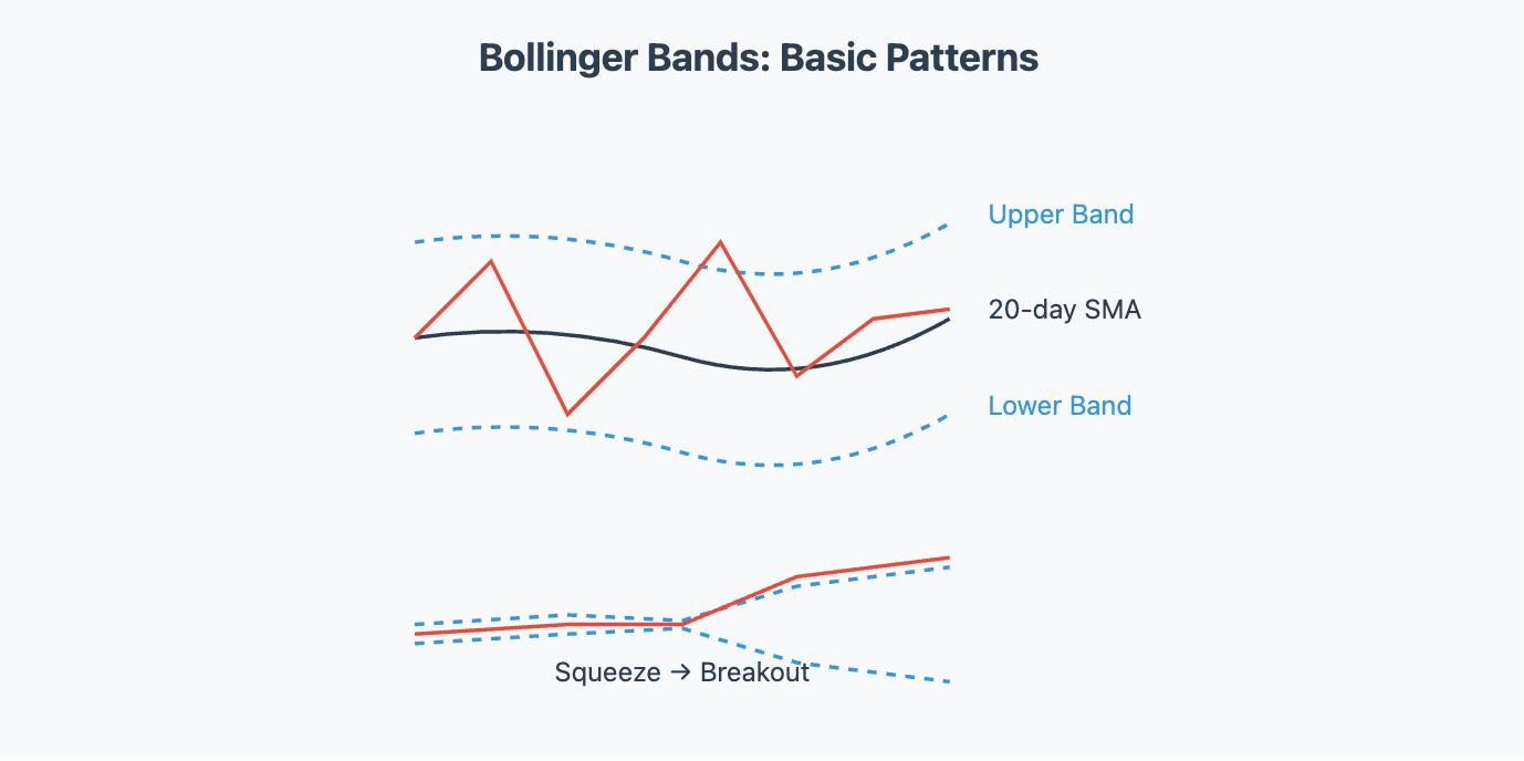
Bollinger Bands:
These are volatility bands placed above and below a moving average (usually a 20-day SMA). The bands expand when volatility increases and contract when volatility is low. Key points:
Upper Band: Typically 2 standard deviations above the 20-day average.
Lower Band: Typically 2 standard deviations below the 20-day average.
How to use them? When price touches the upper band, the stock might be considered relatively high or overbought in the short term (it’s near the upper end of its recent range). When it touches the lower band, it might be oversold short-term. A common strategy is to look for mean reversion – price tends to migrate back toward the middle (the moving average) after hugging a band, unless it’s a strong trend

Also, the Bollinger Band “squeeze” is a noteworthy pattern: If the bands get very narrow (low volatility period), it often precedes a bigger move or breakout. It doesn’t tell direction, just that something’s gotta give. Traders then watch for the price to break out above or below the band decisively to take a trade in that direction. For example, Nifty Bank Index might go through a quiet period where the daily range is small and bands pinch together; a subsequent jump outside the bands on high volume could signal the start of a new trend up or down.
Interpreting Indicators for Entry/Exit:
Indicators can guide your decisions:
RSI example (entry): Imagine Kotak Bank stock is at ₹1,800 but has fallen from ₹1,950 over the past month. It’s now near a strong support at ₹1,800 and RSI is about 28 (oversold territory). You might say, "Hmm, oversold at support – maybe it’s a good time to buy expecting a bounce." You could enter a long trade with a stop-loss just below ₹1,800 (in case support fails).
RSI example (exit): You hold Asian Paints stock which you bought at ₹2,800. It has now rallied to ₹3,200 and RSI is reading 75 (quite high). The stock is also near a known resistance from a previous peak. This might be a cue to take some profit or at least be alert. You decide to sell half your position to lock in gains, because an RSI that high suggests a pullback could be near.
MACD example: You’re watching Axis Bank shares that have been flat but you notice the MACD just had a bullish crossover below zero and the histogram bars are turning positive. A few days later, the price starts edging up and breaks above its 50-day MA. Seeing momentum (MACD) and price action align, you take a long entry, setting a stop-loss below recent support. Conversely, if MACD crosses down, it can warn you to tighten stops or exit a long trade.
Bollinger Band example: ITC Ltd is trading around ₹330 and has been in a gentle uptrend. Suddenly it has a big burst up to ₹350 and peeks above the upper Bollinger Band. This often indicates the price might be due for a short-term cool-off (as it stretched beyond its usual volatility range). If you were looking for a quick trade, this could be a signal to consider selling or at least not initiating a new buy at that moment. On the flip side, if ITC’s bands were very tight and the stock price closes decisively above the upper band on a volume surge, it might mark the start of a significant up-move (a breakout from low volatility).
Remember: No single indicator should be used in isolation. It’s like a doctor looking at multiple vital signs, not just one. Traders often use a combination (e.g., price action + RSI + maybe MACD divergence) to make decisions. And indicators can give false signals, so always manage your risk. Coming up next: we’ll explore chart patterns – shapes formed by price movements that often signal continuation or reversal of trends, and how to trade them.